DTC Popup Fixes
25+ DTC tech accessory brand popups audited — and the same five mistakes showed up every time. Real brands scored against the 7-category 15-Minute Popup Audit Kit, with specific fixes you can hand straight to your dev team. Your popup stops attracting discount hunters and starts attracting buyers who understand why you're worth full price. New here? Start with the free Popup Fix Kit — a 5-day email course covering the five mistakes I find in almost every audit. popupfixkit.com
Hey — glad you’re here! 👋
Welcome to DTC Popup Fixes: Scored popup audits for DTC tech accessory brands — one real brand broken down every week, specific fixes ready to apply — so your list fills with full-price buyers instead of customers you trained to wait for a discount.
Most DTC tech brands are running the same popup.
A white box. A percentage off. A “No thanks, I don’t want to save money” exit link.
It shows up three seconds after you land on the site, covers the whole screen, and asks for your email before you’ve had a chance to understand what the brand even does.
That popup isn’t a growth strategy. It’s a discount habit dressed up as one.
The brands that build lists worth something lead with expertise — not 10% off. That’s what this newsletter is about.
💼 Who is DTC Popup Fixes for?
DTC Popup Fixes is written specifically for:
- DTC founders and CEOs at tech accessory and consumer electronics brands — You’ve built a premium product. You have a social following. But your email list is full of people who only buy when you go on sale, and you know something is off at the top of the funnel. This newsletter gives you a scored, structured look at exactly what’s broken — and what to do about it.
- Growth marketing executives at DTC tech brands — You’re running the email program, managing the popup tool, and fielding pressure to hit subscriber numbers. You need fixes specific enough to hand to a developer and credible enough to sell to a founder. That’s what every breakdown delivers.
- DTC operators who’ve tried optimizing their popup and nothing moved — You’ve changed the headline. You’ve tested the timing. You’ve A/B tested the button color. The numbers still aren’t where they should be. The problem probably isn’t execution. It’s the offer — and this newsletter will show you why.
❌ The biggest problems with DTC popup strategy
If you found this newsletter, you were probably looking for a solution to at least one of these.
- Problem #1: The discount default — “10% off your first order” has become the industry reflex. It’s easy to set up and easy to defend. It’s also training your customers to never pay full price and attracting the kind of subscriber who bought once with a coupon and never came back.
- Problem #2: The wrong first impression — Your popup is the first thing a significant portion of new visitors see. Most brands waste that moment on a discount. A premium brand’s first impression should establish expertise, not desperation.
- Problem #3: Generic headlines that could belong to anyone — “Join our community.” “Be the first to know.” “Sign up for exclusive offers.” None of these tell a visitor why your brand is worth their inbox slot. If your headline could run on a competitor’s popup without anyone noticing, it needs a rewrite.
- Problem #4: A mobile experience that was never tested on an actual phone — Full-screen takeovers on mobile are significantly more aggressive than on desktop. Tiny CTA buttons. Copy that wraps awkwardly. Email fields that require zooming. Most brands design for desktop and assume mobile will figure itself out. It doesn’t.
- Problem #5: Timing that signals panic — A popup that fires two seconds after landing on a site is a brand that doesn’t trust its own product to hold attention. Visitors who haven’t had time to understand what you sell aren’t ready to give you their email. Timing is the difference between a popup that feels helpful and one that feels desperate.
- Problem #6: A thin value exchange — “Subscribe for updates” is not a reason to hand over an email address. If what you’re offering in exchange for a signup wouldn’t make someone stop scrolling, it isn’t enough.
- Problem #7: No exit strategy — When a visitor closes your popup, most brands let them go completely. Some of those people aren’t saying “never” — they’re saying “not right now.” A persistent banner or a lighter second ask can recover a portion of those closes without being aggressive about it.
- Problem #8: Copy that talks about the brand instead of the buyer — “We make premium cable management solutions” is about you. “Stop losing cables behind your desk” is about them. Most popup headlines are written from the brand’s perspective. The best ones are written from the visitor’s.
- Problem #9: A list full of bargain hunters — A discount popup doesn’t just attract the wrong subscribers. It actively filters out the right ones. Buyers who understand why a $300 tech accessory is worth $300 don’t need 10% off to make the decision. They need to understand what makes it worth full price.
- Problem #10: No framework for knowing what’s actually broken — Most popup optimization is guesswork. Change the headline, see what happens. Adjust the timing, see what happens. Without a structured way to score each component of a popup, you’re iterating without a map.
👉 What DTC Popup Fixes delivers every week
Every week, I score a real DTC tech brand’s popup against a 7-category framework — and show exactly what I’d fix.
✅ A scored popup audit
Each breakdown runs the brand’s popup through seven categories: Headline/Offer Strategy, Copy Clarity, CTA Button, Mobile Experience, Timing/UX, Design, and Exit Options. Scores are out of 86 points. The three lowest-scoring categories become the three problems I focus on in the issue. You get a number, not just an opinion.
🔧 Specific, actionable fixes
Every problem section ends with a concrete fix. Not “consider improving your headline.” Something specific enough to hand to a copywriter or developer and have them execute it this week — even if you’ve never audited a popup before.
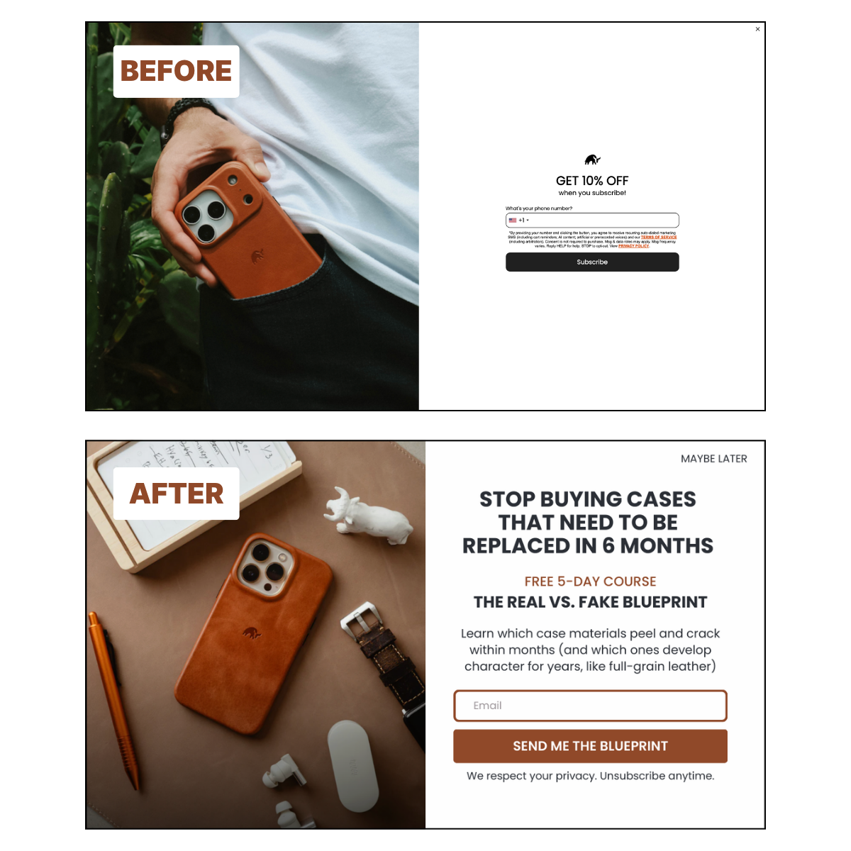
✨ Before and after mockups
Each issue includes a visual before/after showing what the popup looks like now and what it could look like with the fixes applied. The argument lands faster when you can see it.
🤗 The education-first alternative
When a brand’s offer strategy is the core problem — which it usually is — I show what an educational lead magnet could look like in place of the discount. Specific to the brand, specific to their customer, specific to what that customer actually needs to understand before buying.
👋 Who am I?
I’m Gannon Nordberg — a solo operator and email marketing specialist focused on one specific problem: DTC tech accessory brands leading with discounts when they should be leading with expertise.
My core belief is straightforward. A 10% off popup attracts bargain hunters. An educational offer attracts buyers who understand why the product is worth full price. For considered purchases in the $100–$500+ range, the discount isn’t the difference between buying and not buying. The education is.
I built the 15-Minute Popup Audit Kit — a 7-category, 86-point scoring framework for auditing any DTC popup in under fifteen minutes. Every newsletter breakdown uses the same framework, so you can apply the same diagnostic to your own popup while reading about someone else’s.
I also offer the Browser-to-Buyer Blueprint — a done-for-you service that builds an educational email course for DTC tech brands ready to replace their discount popup with something that actually builds a list worth having.
📍 Start here — free
Before the next breakdown lands in your inbox, the Popup Fix Kit is the fastest way to understand what’s actually wrong with your popup.
It’s a free 5-day email course covering the five popup mistakes that cost DTC tech brands subscribers every day — including why leading with a discount is the most expensive one.
Get the free Popup Fix Kit →

🌟 Popular posts
Want to see what a breakdown looks like?
Start here:
- The free gift popup that almost works: 3 problems holding Nomad back
- MOFT's popup vs. their product design: One is exceptional. One isn't.
- Bullstrap's 10% off popup backfires: 5-second popup, 10% off, phone number required
More breakdowns are added to the archive every week.
🚀 Ready to go deeper?
If you want to replace your discount popup entirely, the Browser-to-Buyer Blueprint is the done-for-you version. I build the educational email course for your brand — the offer, the copy, the sequence, the strategy.
Book a free 30-minute strategy call →
Until next time, see ya!
Gannon